The Color Cream | Meaning and Psychology
What do you think of when you see cream colors? Maybe a warm coffee, an old photo, or a soft sweater. But the cream palette is much more than a light, off-white shade.
It’s a very flexible color that carries deep meaning. It stands for simple elegance, quiet calm, and innovative style. You see it everywhere: in new clothes, home designs, and famous brands.
Knowing what makes the cream color special and how it affects people isn’t just for artists or designers. If you understand its power, you can truly improve your designs, make your home feel more welcoming, and boost your marketing efforts using a good logo maker.
Let’s explore the fascinating world of the color cream. We’ll look at what it means, how it affects us, and how it’s used in design.
The Rich History and Culture Behind Cream
The story of the color cream is as rich and smooth as the real thing. It has existed for centuries, carrying different meanings in various times and places.
Where did the color name come from?
The word “cream” was first used to describe a color in English in 1590. It is named after the creamy, yellowish-white substance that rises to the top of milk. This natural connection gives the color a sense of authenticity and organic warmth. It comes from the milk butterfat, especially cows that eat fresh grass rich in yellow plant pigments.
What color is cream?
Historically, cream wasn’t just a pretty color. It was often a sign of importance and good taste.
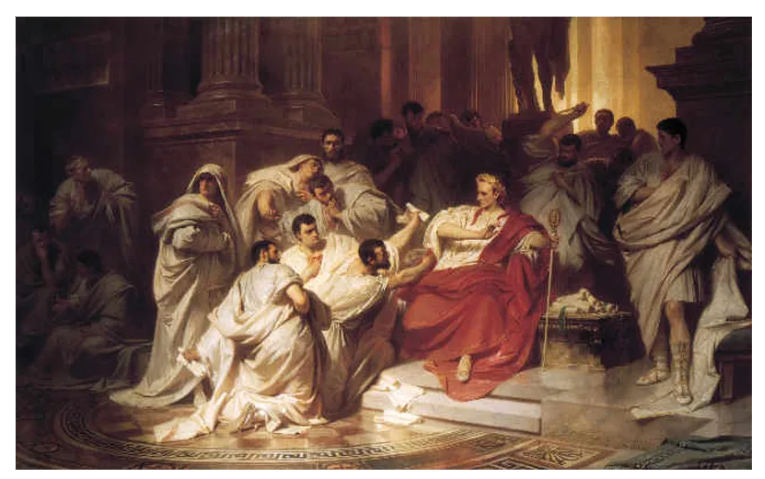
- In ancient Rome, for example, important people often wore cream-colored togas, which showed their high rank and status.
- During the European Renaissance, cream was popular among the wealthy and powerful. You’d see it in their fancy clothes and beautiful tapestries, further linking cream to luxury and refined taste.
Today, cream continues to represent some very positive ideas. In many wedding traditions, cream is used in bridal gowns and decorations. It symbolizes the purity and innocence of the bride and the beginning of a fresh, new life together.
Psychological Implications of Cream
In color psychology, cream can calm and soothe us. Think about walking into a room with cream-colored walls. It instantly feels peaceful and relaxing.
This gentle warmth can create a truly comfortable and inviting atmosphere, making it perfect for places where you want to unwind or think deeply. It helps develop a sense of balance and harmony, making any space feel composed and serene.
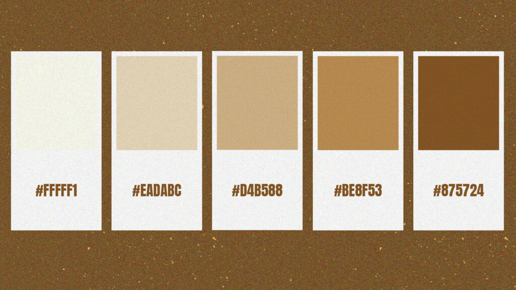
What we connect with a cream color palette
Cream is often linked to certain feelings and ideas:
- Purity and innocence: Because it’s so gentle and light, cream naturally brings feelings of innocence to mind. That’s why you often see it in nurseries and children’s rooms, where a soft, nurturing vibe is right.
- Elegance and class: A cream-colored outfit almost always looks elegant and sophisticated. It’s a classic choice that suggests timeless style rather than fleeting trends.
Cream vs. white
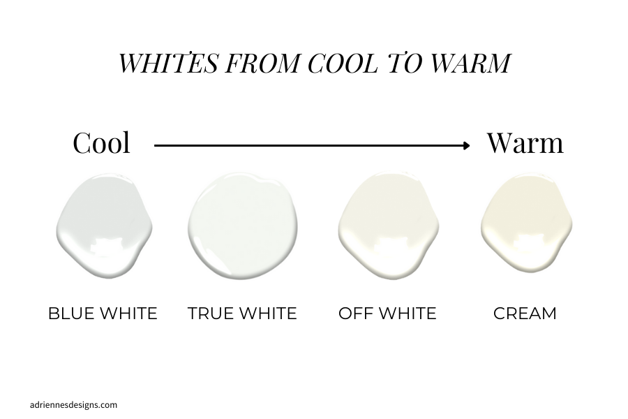
You might think cream is just a shade of white, but there’s a key difference. While white can sometimes feel harsh, cold, or even sterile (think of a doctor’s office), cream offers something different.
It’s much softer, more inviting, and has a noticeable warmth. This makes cream feel cozier and more approachable, giving off a subtle glow without losing that sense of brightness or cleanliness.
Cream in Branding and Marketing
The color cream is a secret weapon for businesses looking to make a memorable impression.
Building your brand’s look
Cream is fantastic for building a distinctive brand identity. Its refined, soft, and professional vibe is perfect for small businesses that want to stand out without using loud or overwhelming colors.
Unlike trendy, bright colors that can quickly go out of style, cream suggests reliability and quiet sophistication. This helps new or emerging brands build trust with their customers.
Consider how these cream-colored templates evoke freshness and simplicity:
Logos
Flower Ice Cream by BrandCrowd

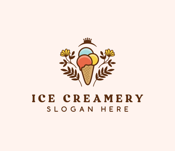
Creamery Ice Cream by BrandCrowd

Lamp Furniture Lighting by BrandCrowd

Decorative Light Bulb by BrandCrowd
Websites
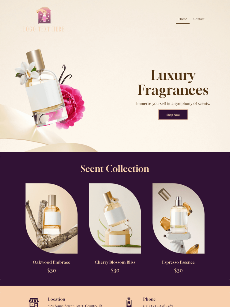
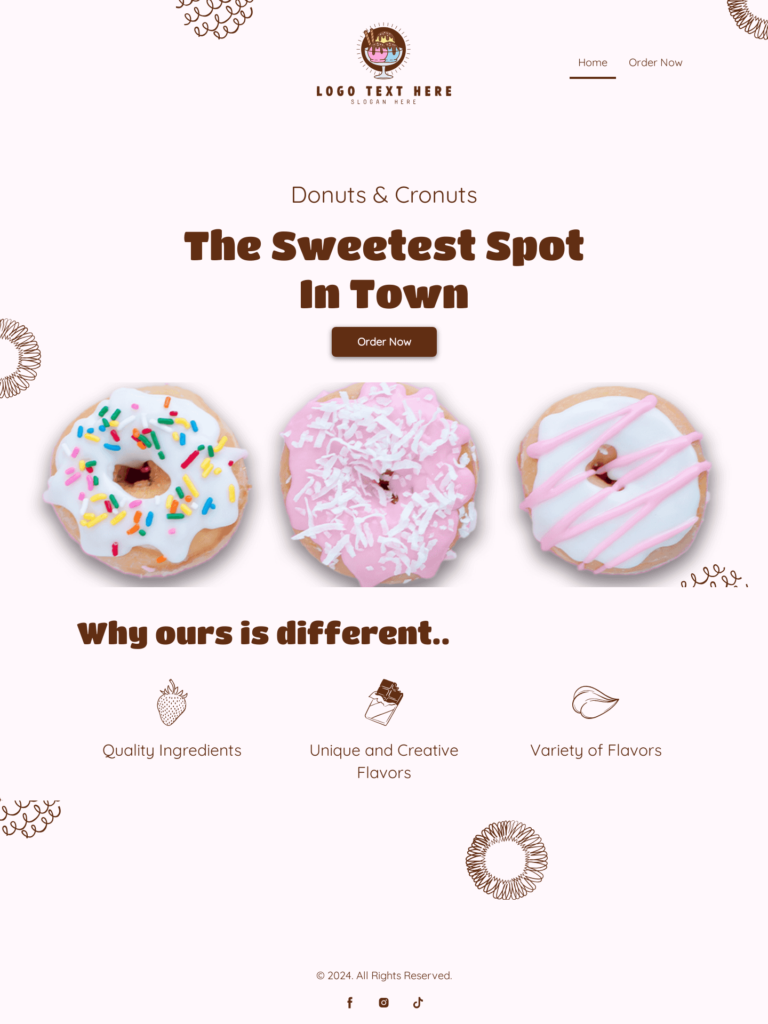
Business cards
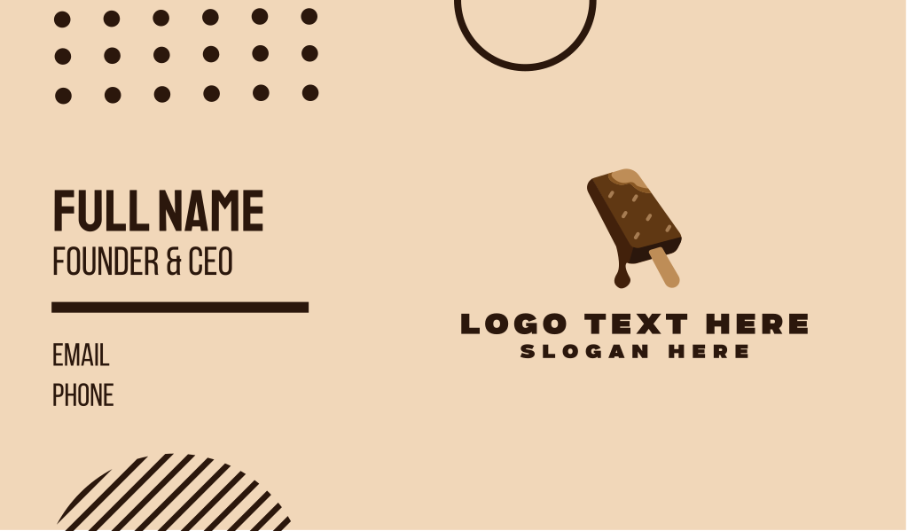
Chocolate Ice Cream by BrandCrowd

Flyers

Light Academia Study Playlist by Design

Posters

Neutral Collection by BrandCrowd

Shaping how people see your brand
Color is crucial in how people perceive your brand. Studies show that 90% of a customer’s first impression is based on color alone. This highlights just how much power the right hue has in branding.
Cream is especially appealing to customers who value upscale, quality products. This makes it an excellent choice for small businesses in wellness, handmade goods, boutique fashion, or sustainable products, where a feeling of gentle luxury is key.
Looking luxurious on a budget
You might think looking luxurious requires a huge budget, but cream proves otherwise. It offers affordable elegance. For businesses that don’t have the funds for expensive, lavish rebrands, cream can signal high quality and luxury without the high cost. Small brands can also explore creative ways to elevate their look – such as experimenting with textures, finishes, or taking the time to discover printing options that make cream-based materials appear more refined and professional.
Pairing a cream color palette with classic elements like serif fonts or minimalist logos communicates that your brand is intentional and offers a premium product.
A Tip for Your Brand
When designing your website, packaging, or marketing materials, try using cream as your primary background color. Then, add just one contrasting accent color (like royal blue or magenta).
This simple trick helps to guide your customers’ eyes, drawing their focus to key information or products. It can even lead to more sales or “conversions” on your landing pages.
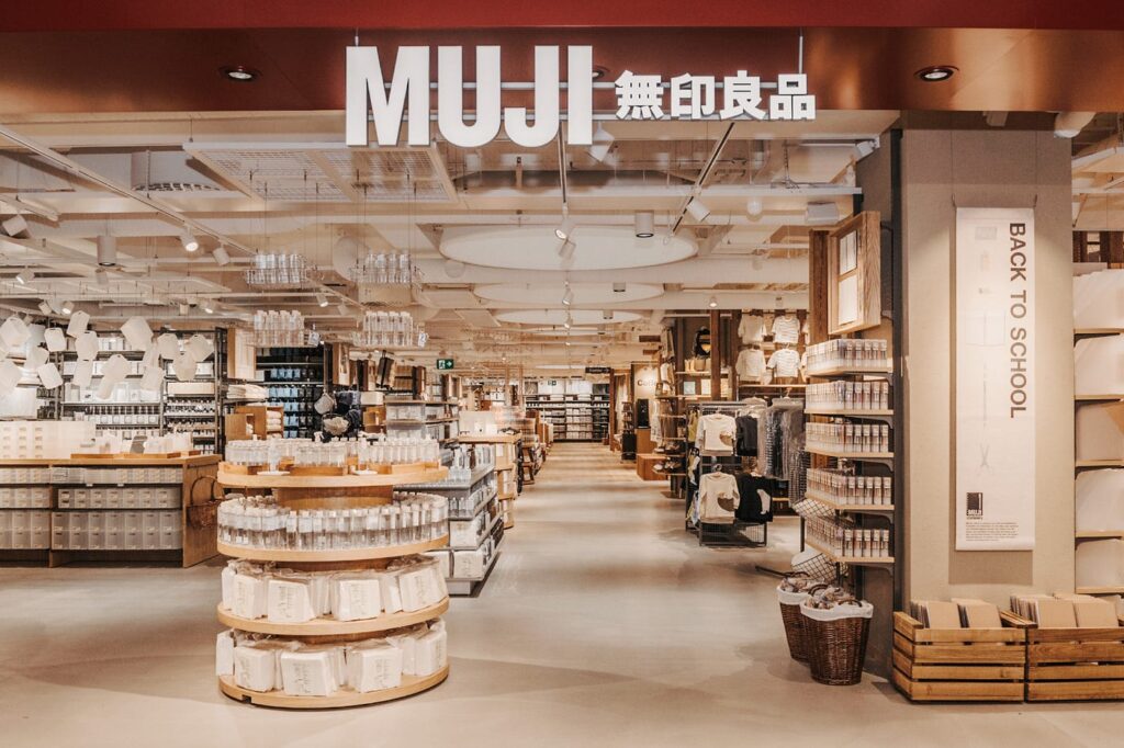
Consider the classic branding of brands like Muji, for instance. While not exclusively cream, their aesthetic relies on muted, natural tones, including off-white and cream, as a primary background, often paired with simple black or subtle earthy tones for text and accents. This minimalist approach guides the eye and emphasizes product quality and simplicity.
Practical Applications of Cream
Cream isn’t just theoretical. It has many valuable applications in the real world, making things look better and feel more functional.
Interior & retail space design
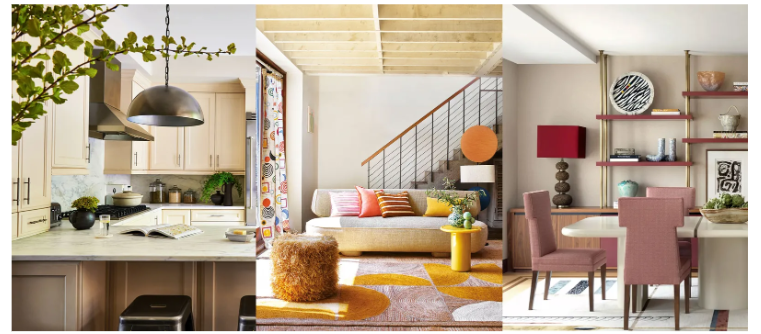
Cream walls and furniture can create an incredibly calm and welcoming atmosphere for small boutiques, hair salons, or coffee shops. This encourages customers to stay longer and feel more comfortable.
A neutral cream color palette also has another benefit: it allows any featured products, like handmade jewelry, unique artwork, or even potted plants, to stand out. This helps guide customer attention exactly where you want it.
Product presentation & packaging
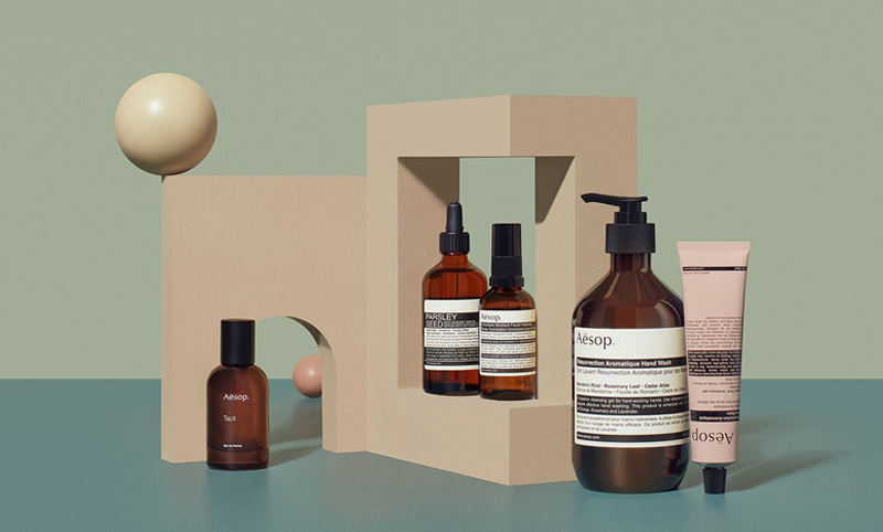
Cream-colored packaging is a fantastic choice for presenting a product. It immediately suggests elegance, sustainability, and premium value, making it perfect for small-batch products such as high-end skincare, artisanal candles, or gourmet foods.
A simple, minimalist cream label combined with subtle metallic or dark accents can significantly increase a product’s perceived quality without raising production costs.
Apparel & textile branding
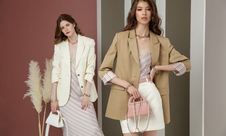
For businesses in the fashion world, cream garments or accessories offer a timeless appeal and can reach a vast audience. It’s especially effective in bridal wear, formal clothing, or eco-conscious clothing lines where an understated sophistication and a connection to natural, quality materials are important.
The Enduring Power of Cream
From its rich history to its calming psychological effects, cream color consistently brings feelings of purity, elegance, and peace. It’s a remarkably versatile hue, perfect for crafting a distinct brand identity with affordable sophistication, and for making everything from cozy homes to luxurious products shine.
Bring the tranquil elegance of cream into your next design project through BrandCrowd. It offers an extensive collection of cream-inspired design templates for logos, posters, business cards, websites, and many more! You’ll find everything you need to create a sophisticated and memorable visual identity that resonates with your audience.
Give your brand the touch of class it’s been waiting for.
Read more on designs here:
- 50 Summer Logos for a Fresh Seasonal Rebrand
- How Digital Gift Cards Can Supercharge Your E-Commerce Marketing Strategy
- Subtle Logo Updates: The Power of Minimal Changes
Frequently Asked Questions (FAQ) About the Color Cream
- What emotions does the color cream evoke?
Cream primarily evokes feelings of calmness, relaxation, and elegance. Its subtle warmth contributes to creating serene and comfortable environments. This makes it ideal for spaces where a sense of peace and understated sophistication is desired.
- How is cream used in branding?
In branding, cream effectively conveys sophistication, luxury, and reliability. It enhances brand perception, making products or services appear high-quality and trustworthy. This helps brands stand out with a refined and timeless appeal.
- Is cream suitable for modern interior design?
Yes, cream is highly suitable for modern interior design. It provides a neutral and warm backdrop that beautifully complements a wide variety of modern elements and styles. Cream can make a space feel inviting and cozy, allowing furniture and artwork to shine without overwhelming the senses.
- What is the difference between cream and white in design?
While both are light tones, pure white can often appear stark or sterile in design. Cream, conversely, offers a noticeably softer, warmer, and more inviting ambiance. Its subtle yellow or beige undertone gives it a rich, comforting feel, making spaces feel more welcoming.
- Can cream be combined with other colors effectively?
Absolutely. Cream is incredibly versatile and pairs effectively with both bold and muted tones. It acts as an excellent base color, making vibrant hues pop or creating a harmonious, sophisticated palette when paired with other neutrals.
Hannah Suroy suroy loves turning big stories into easy-to-digest articles about movies, TV, business, and more. These days, she mainly writes creative articles and insights focused on the world of design.
Original Artwork by Khim John Blazo
